Sunday, April 7, 2019

Reflection

This is the final reflection of my project. I have included a link to view it through Google, or you can read it down below here on my blog.


Reflection
My name is Vanessa Renslow and I decided to choose a beauty and lifestyle magazine as my media project. Starting this project, I immediately knew that I wanted to do a beauty magazine to express my love for all things beauty and fashion and share my opinions and thoughts about topics related to women. I am currently a working freelance makeup artist and I have always wanted to be able to express my thoughts about beauty through some sort of platform, whether through a video or written platform, and this project gave me the opportunity to express myself through creating and writing a magazine.
Everything featured in this magazine was curated by me and I fully stand behind my work. I fully believe in everything I've written and published and I hope this magazine makes you as happy as it makes me. I want every woman who reads my magazine to feel empowered and confident to achieve anything she wants. Thank you for following me on my journey of creating this wonderful project!
Starting out my project, I wanted to challenge the conventions of a fashion magazine by having it focus mostly on beauty. Currently, there are not any full-blown makeup/beauty magazines, so by creating this magazine focusing specifically on beauty, I was already challenging the conventions. Not only will my magazine be focusing on fashion, but makeup, beauty, and lifestyle as well. Besides challenging the content conventions of fashion magazines, I also challenged magazine mastheads. Mastheads are large, and usually cover the whole upper area of the cover, however, I chose to do something a bit different. I chose to have the masthead be medium sized and located at the upper left-hand corner. However, the actual name of my magazine “REN” follows the genre conventions of fashion magazines. When first starting to name my magazine I was bouncing back and forth between different feminine adjectives because many fashion magazines use this as their name, like 'Cosmopolitan' and 'Allure'. However, that just seemed very basic so I wanted to possibly use a person's name as the title of the magazine, like 'Marie Claire’ or ‘Elle’, and that's when it hit me! I wanted to use my last name 'Renslow', but instead of using my whole name I would only use "Ren". I wanted my magazine to be sophisticated and I thought this name was succinct, easy to say, it sounded classy and it fell under the genre characteristics of names for female magazines. And an additional side note you probably didn’t know: ren actually doesn’t mean anything in the English language but in China, it means love or goodness, while in Japan, ren is the name of the lotus or lily flower. After I found this out, I thought about how beautiful that sounded and I knew that that was exactly what I wanted my magazine to be named after. While looking through my magazine, there is usage of the colors white, light pink and hot pink. The colors I used on the cover were representative of the Pantone Color Institute colors of the year 2019. I was in love with all the colors of 2019 and I, of course, love pink so I was glad to see that Dusty Rose and Peacock Pink were chosen as this year’s colors. I wanted to incorporate these colors throughout my entire Spring issue of REN.
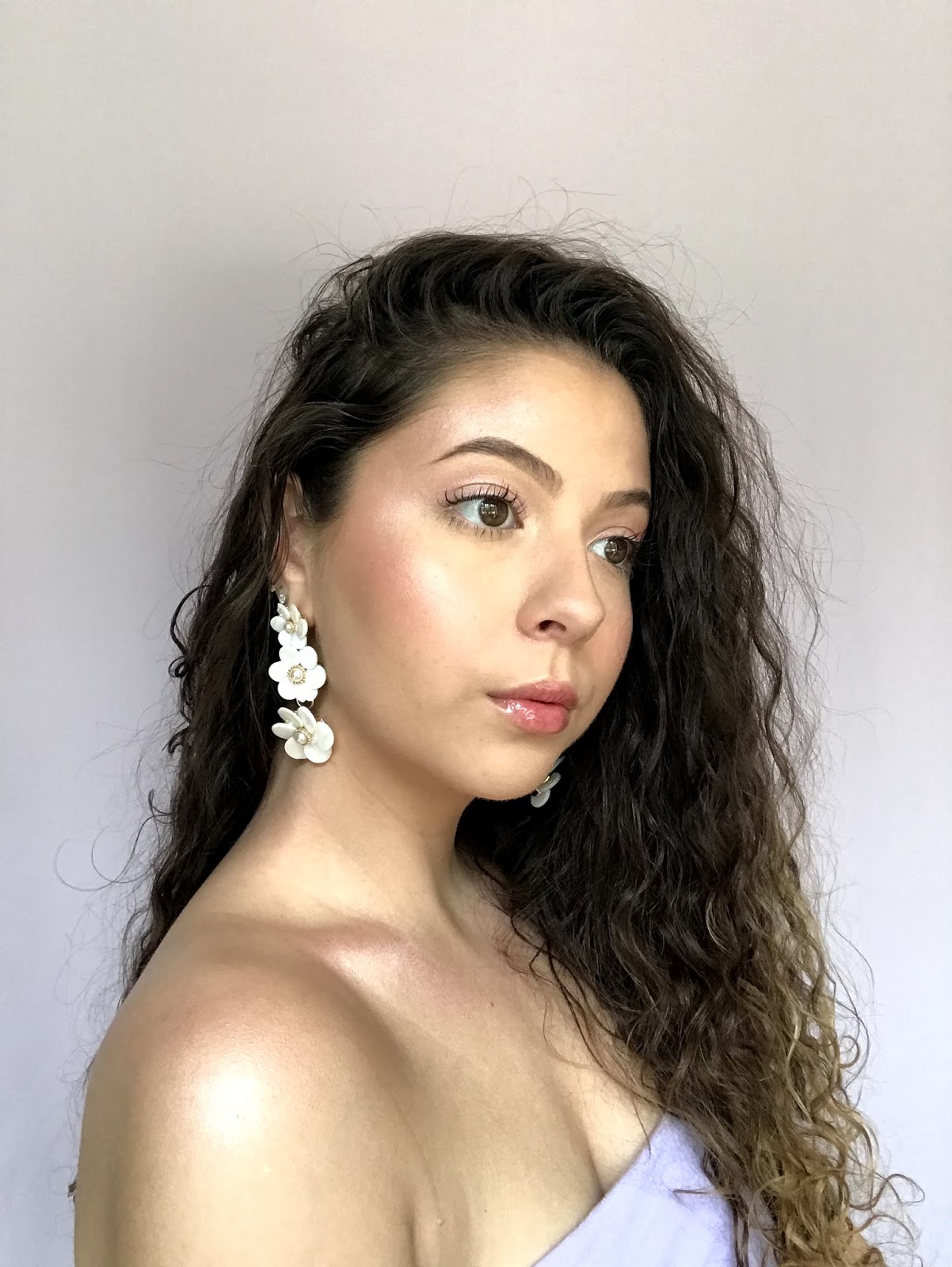
Continuing on, the front cover of my magazine features a close up of a model looking directly at the camera and well, the audience and basically inviting them to open the magazine and find out more information. Additionally, when it comes to makeup magazines I think it’s extremely important that the subject looks directly at the audience because it draws the viewer's’ attention to the eyes and therefore the makeup, which is obviously significant in a beauty magazine. This feature is very present in most fashion magazines. Furthermore, most of my cover lines follow the characteristics that draw in the interests of the readers by having succinct phrases about topics that could interest our target audience: females ages 16 to 35 in the middle class. After doing research I found that Vogue’s target audience was similar to what I wanted but they target women with higher incomes. However, I wanted to avoid doing this because I wanted my beauty magazine to be accessible to more than just the higher upper class, but to all women. Not to mention, most younger women ages 16 to 25 are those who mostly use makeup and follow current trends and products.
Moreover, on to the table of contents, I wanted to do something really different and I wanted to make sure it stood out from the traditional contents.  I knew I didn't want to make a basic table of contents that was boring and full of small letters, I wanted to do something fun, colorful and girly. I decided to go with the hot pink from the Spring 2019 colors to use throughout my magazine. I thought this pink was a great pop of color and I just love pink! I wanted to include many colorful pictures and have very few words or paragraphs. As a beauty lover myself, I like to see more visuals, bright colors, and pictures that almost look 3D, which to me are all just really visually appealing.
Lastly, we have my actual double page spread which is very near and dear to my heart. If you know me, you know that I am very girly and I love beauty and fashion, but that’s not all. I love to vouch for women's rights and I think women empowerment is an essential topic to cover this year and all the many ahead of us. As it is known, women were treated as less and unequal to men in the past, but that ends now, at least for me. I want to make sure that women stand up for themselves and be the most powerful and confident females they can be, which is why I chose to write this article. Although this topic may not be too traditional for an all makeup and beauty magazine, this topic is very common in women’s magazines. Everything written in this article was curated by me and these are all tips I have learned along the way of growing up into a woman in the 21st century and I would love to share with my female peers and even those who may be older and not raised in this generation. So, this article includes 5 tips on how to be the perfect girl boss: confident, beautiful and powerful.
While actually creating my magazine I used a website called Joomag, which I think was the perfect website to create this magazine. The website software had so many different fonts, you could use any colors you wanted, manipulate texts and photos, and I thought it was very user-friendly once I got the hang of it. The website itself already has templates based on the genre of your magazine, but I chose to start from scratch. In Joomag, I was easily able to manipulate photos and place them wherever I wanted, and not to mention, when actually creating my project it had a real magazine format and there were even sounds of pages flipping as you went through the magazine. It actually felt like a real print magazine, so I was really happy using this software. By using Joomag it really expanded my creative abilities and made me think outside the box. I had to create the whole layout and pick fonts and colors all on my own. The next set of software and websites I used were LunaPic, SnapSeed, and Facetune. I, unfortunately, don't own the Photoshop or Lightroom and I don't own a fancy camera or lighting equipment, so I had to improvise. I took the photos on my iPhone 7 plus and used natural lighting for all my photos because I find that works best when photographing makeup. I stood in front of my window for hours taking pictures of myself for the cover. I take makeup photos for the blog I already have, therefore, I already had a set of backgrounds to use for the cover. Instead of spending hundreds of dollars on paper backgrounds with a stand, I did a little DIY project last year and created something amazing. I bought a $10 clothing rack from Ikea, some colorful fabric, and some heavy duty clips from Home Depot. The whole background probably cost me $25 as compared to other backgrounds that could run for hundreds. I took my cover photos with this background, but for my other photos, I just used a white poster board as the background. The photography process was more difficult than I anticipated. I had a hard time with lighting and shadows and I was very concerned about how I was going to edit my photos without Photoshop or Lightroom. However, I did a little digging and found this free app called SnapSeed, that has very similar features to Lightroom but for free on an app. I used SnapSeed to edit the lighting of my photos, and I used Facetune to edit more in-depth by manipulating colors, shapes, and sizes. However, I was still concerned about how to remove the background of my images to make them transparent and basically convert the photo into a png.
However, I did get lucky because I found a free website called Lunapic that lets you edit backgrounds, but this website was horrible and really difficult to use. It took me about 1 hour to edit the background on a photo when I know that on photoshop it could take me about 5 minutes. However, I did what I had to do to complete my magazine. But when looking back at all my work, I’ve come really far and have definitely learned a lot in the field of editing and photography, but I have also learned about all the hard work that comes into play when publishing a magazine, whether in print or electronically. It took me weeks to develop and create a 5-page magazine, I have no idea how difficult it could be to produce a magazine with over 50 pages! I came into this project with basic knowledge and skills in editing, designing, and photography, but after finally completing my project, I can say that my technological and creative skills have developed tremendously. I have been able to grasp the importance of lighting and shadows in photography and the extreme importance of editing. I always knew that editing was important in a magazine, but I never realized what a big part it plays. Not to mention I have discovered a new app, SnapSeed, that has shown me all the different ways to manipulate lighting, shadows, saturation, sharpness and much more. I can definitely see myself using this app in the future.
Additionally, something important to mention is how I would be distributing my magazine if it were real and actually being published. I would want to distribute my magazine online and in-store. I would want my magazine to be featured at book stores and popular beauty stores like Sephora and Ulta where most makeup lovers go. Besides actual print, it’s essential to also have an online presence where our younger audience can access the magazine through an app or website. I want to make sure that REN has its own social media accounts with direct access to REN’s new magazine issues. I want to have a website for REN where they can fully access the magazine online through a computer, tablet, and smartphone. And lastly, I would like to have an app where our customers could view our magazine where ever they are, as long as they have a smartphone. The app will not only include the magazine, but other small articles, interviews, and quizzes.

I am so happy and proud of my magazine! Thank you for giving me the opportunity to express my opinions and creativity with this project.

Wednesday, April 3, 2019

Ren Magazine: Spring of May 2019

Here is the link to my final magazine and first official issue of REN Magazine! I am so excited and proud of what I've created and I hope you all enjoy my magazine and hope it brings a smile to your face. I've worked extremely hard and have put so much effort into details such as colors, logos, and pictures. Everything featured in this magazine was curated by me and fully stand behind my work. I fully believe in everything I've written and published and I hope this magazine makes you as happy as it makes me. It has always been my dream to create some sort of publication like this one where I get to express my creative abilities while including interesting beauty topics and advice for women. I want every woman who reads my magazine to be empowered and confident to achieve anything she wants. Thank you for following me on my journey of creating this wonderful project! Stay tuned for more behind the scenes information on my publication.

https://joom.ag/z9ja


Sunday, March 31, 2019

Beginning My Layout

The picture shown below is the beginning stages of my layout and I love it. I was playing around with the different ways that I wanted to lay out the writing portion of my spread by testing out different formats and fonts, but this is what I came up with after all. This does follow general genre conventions for magazines and I believe that after I add some light colored shapes to the background to add some color and creativity, everything will come together. Below is an attached picture of my layout so far. I still have to add my small summary of the article but I will probably focus on pictures first and then the layout. Additionally, one other important feature that I need to add are the fashion credits that state where all the clothing is from and how much it costs. This feature is something relly important in fashion magazines and gives credit to the designer and also tells people where to buy the clothes featured in the magazine. I will add this to the picture, add the missing intro and shapes and I will be done! I'll keep you guys updated on my layout progress.


Thursday, March 28, 2019

Finished Writing

I have finally finished the complete writing portion of my magazine and I am so excited to share it with you all. This article is very important to me and the reason I wanted to write about it was to empower other women and teach them some tips I have learned along the way of being a lady boss! Down below is a sneak peek of the writing that will be featured in my magazine.

Introduction:
Do you want to be a powerful girl boss? If you do, keep reading to find out our top 5 tips on how to make your dreams come true while staying confident and beautiful. All of these tips were perfectly curated by REN’s magazine editors and inspired by some of the most influential and incredible. female leaders.

#1 Don’t Back Down From an Opportunity:
In this day and age, women seem to be breaking away from the standards of the workforce. More women are becoming CEO’s and right now the youngest self-made billionaire is a female, Kylie Jenner. It’s important to seize any opportunity you can get if you want to see a change in yourself, your life, and in the world. Women have always been unequal to men, in many senses, so if you have the opportunity to get promoted at work, go for it! If you have the opportunity to buy a new purse to treat yourself, go for it! There are endless opportunities to empower yourself and make you feel happy, so any opportunity you get, don’t back down.


#2 Dress to Impress Yourself:
The common phrase is ‘dress to impress,’ but this tip is a little different. If you want to feel confident, perform well, and look good, then dress like a boss. No matter the task, whether you’re about to take a 3-hour exam or walk into a job interview, put clothes on that make you feel good because if you feel good, you perform well. A girl boss doesn't dress up or down for anyone but herself, so don’t worry about putting makeup on to impress others, or putting stilettos on to stand out. It is now the time to stop worrying about what others think because if you feel confident, that’s all that matters.


#3 Learn to Say “No”:
When you’re being a hardworking lady boss with a ton of responsibility, it's essential to remind yourself, that it is okay to say no sometimes. You have to know your limits and boundaries and when you’re spreading yourself too thin because at the end of the day you can’t please everyone. Do what makes you comfortable and understand you can't please everyone you encounter. Please yourself and focus on what makes you feel good.


#4 Take No One’s Nonsense:
In the business world, it's important to be kind and understanding to anyone you encounter, the good and the bad. But while being a boss lady you can't let anyone abuse your kindness because they will take advantage of you and you can't let that happen.  Be open-minded but also confident in your decisions and ability to lead; believe in yourself!


#5 Never Forget You’re a Queen:
After reading about these tips, we hope we have inspired you to become the best woman you can be. We wanted to remind you of all that you're capable of achieving, and of course remind you, that you’re a queen. No matter what anyone says or does, it's always important to remember to have confidence in yourself and feel like a queen if you want to be treated like one. *wink* Go out and run this world!

Sunday, March 24, 2019

Started Double Page Spread


So this is my updated progress on my double page spread and I am really happy about it. I have found the perfect fierce picture I want and I decided to choose the term Girl Boss. Additionally, If you pay close attention, You can see there are some fun geometric shapes behind the picture were similar to the inspiration picture from the previous blog. I really love all the fun and vibrant colors and I can't wait to share with you my top 5 tips to being the perfect and confident girl boss you were meant to always be. Only for one of the tips, I  do have a possible description, the other descriptions I am working on and will update you next week.


#1 Don’t Back Down From an Opportunity

#2 Dress to Impress Yourself
The common phrase is ‘dress to impress,’ but this tip is a little different. If you want to feel confident, perform well, and look good, dress like a boss. No matter the task, whether you’re about to take a 3-hour exam or walk into a job interview, put clothes on that make you feel good because if you feel good, you perform well. And don’t worry about dressing up for someone to impress them, or putting on stilettos to stand out, if you feel confident in flats and pink blouse, go for it! Don’t worry about trying to please others, if you feel confident, that’s all that matters.

#3 Learn to Say “No”

#4 Take No One’s Nonsense

#5 Never Forget You’re a Queen

Friday, March 22, 2019

Double Page Spread Ideas

Hello! So, I am pretty much done with most of my magazine and now have to move on to my double page spread and start designing the layout and what I want my content to be about because I am still a little unsure. However, I do have a few ideas that I think would be great to put in a woman's makeup magazine.

The first Idea I have is to not have a traditional three-column double page spread and instead put small paragraphs with pictures scattered around the page. I want to do this on only one page however because if i do it on both pages it might look cluttered and messy and that is not the look I am going for. On the left side have the whole page be one large picture and have a white border with shapes in the background to add a fun touch. And then somewhere near the bottom of the picture I want to put a white circle or box that has a small description of what the spread will be about. And this is my layout idea.

Now, my actual content idea is something a little different and maybe not to traditional for a makeup magazine, but it is very common in magazines for women. I want to do an article on a few steps on how to be the perfect girl/lady boss. **I still haven't chosen which phrase I like better** So what I want to do is put on the left side of the spread, a picture of a powerful and smiling girl to show readers that this is how they should feel after reading the article and following a few tips. Then in the little white circle that I mentioned before, I want to include a small summary of what the article will actually be about and basically say how it is so trendy and now is starting/ trying to be very common for women to be the boss and feel confident and not be fully immersing themselves on the opinions of men and following behind men and now start leading and being their own lady boss and feeling confident about it. This topic is something so important to me and I've always wanted to be able to spread my opinion and tips to other people but I have never had the chance to do so until now. Next, on the right side of the spread, I want to include the numbers 1-5 in large bold lettering to show, this is tip #1, this is tip #2 etc. and next to each number put a small description and possibly a matching photo. 

This is my idea of the spread and by the end of the week, I would like to have started the double page spread and show. The pictures below can help you visualize my ideas.

Related image

Thursday, March 21, 2019

The Reasoning Behind my Cover Lines


 As per my previous post showing you guys my finished cover, you were probably wondering why I chose the cover lines I did. It's obvious that cover lines are extremely important because that's one of the main reasons people pick up a magazine or buy it, besides that actual main cover image. I thought that after I had placed the main cover photo that it looked too boring and I even thought that I wouldn't buy the magazine! So, I knew I had to make a change. I researched a few different fashion and beauty magazines to gather some inspiration and within about 45 minutes I had all the cover lines I wanted. I knew I didn't want too many cover lines because that would overwhelm the cover and make it look crowded. 

The big and obvious cover line is "Spring 2019 Makeup" and this is mostly what the magazine is about. Since this issue is the May issue, it's mostly all about trends for the spring and will incorporate spring colors and looks. The next cover line is '15 Looks to Jump Start Your Season" Since this issue is all about makeup looks and trends of spring, it only makes sense to include looks that our readers can recreate. The next cover line is "Get the Nam Vo Glow". Nam Vo is a very famous celebrity makeup artist who is known for giving her clients beautiful, fresh and glowing skin. Her makeup skills are amazing and she is my favorite celeb artist, so I thought it would be a cute touch add her to my cover. The next cover line is "The Ultimate makeup rundown". In my table of contents, there is a section that talks about makeup products used at this year's Paris fashion show, so this cover line corresponds to that section. When people see 'The Ultimate" that immediately draws their attention and they want to know what is that great, so that's why I chose that wording and it corresponds to the TOC sections. The next cover line states "The Perfect Girl Boss". The trend of being a girl boss and being a strong independent woman is super in and every woman, in my opinion, should know how to be a strong girl boss, so that's why I wanted to include it. The next cover line states "Secrets to Fresh and Healthy Skin". Healthy glowy skin is a huge trend of spring 2019 and it seems as though it's going to be popular for a long time and I wanted to include it since it's very trendy and was seen all over the runway.

Tuesday, March 19, 2019

Finished Cover

This week I officially finished my cover for my magazine. If you can recall, at the beginning of my blog, I wanted to challenge the conventions of a magazine, but after I finally chose my cover photo, I changed my mind. Just having the photo and the one large cover line and my logo looked too plain and frankly, it didn't really look like a magazine. I realized I needed something more on my cover to make it pop and actually make people want to pick up,  so I decided to incorporate cover lines with different fonts, of different colors and sizes. 

After I incorporated my cover lines, I felt as though my whole magazine came to life. I was able to incorporate the initial light and hot pink I talked about in a previous blog post, and the colors just went perfectly together. The font I chose was that similar to the one used in Vogue, which is my inspiration. Also, the other font I used to make the cover pop was a big cursive fun font that I used in my main large cover line where it says 'makeup'. I thought that font was so girly, feminine and made all the words come together and stand out.


This is my official finished cover and I loved the way it came out. I loved the combination of colors such as the muted pink, hot pink, and the lilac color of my shirt. The peachy pink of my lipstick and light pink highlighter came together to tie back into the colors of the font and compliment each other very well. 


Sunday, March 17, 2019

Double Page Spread Inspiration


After finishing my cover, although I haven't completely finished it, I need to move on to my double page spread. So like I did with my table of contents, I have searched for some inspiration to draw from. I am still thinking about what exactly I want to make my article about but its most likely going to be about women empowerment or spring makeup trends. The pictures I have included below are all quite similar. As you can tell throughout my magazine, I have been really trying to incorporate more photos than irrelevant words. The inspiration pictures below have many photos and makeup products that make the double page spread very interesting, almost 3D or like a collage which is fun and appealing to the eyes.

I feel as though the pictures included below are all very colorful and have different textures and dimension that add to the spread. Besides these actual photos, there aren't too many words on any of the examples shown below, the only words featured are extremely relevant to the spread and correspond to a specific photo, or phrase, and go along well with the article. However, each article differs in its own way, for example, the first one includes many photos and basically just gives short and brief beauty news which is something similar to what I want to do with the spring makeup trends. I want to give short and brief descriptions about the trend and include a matching photo. However the second example is more storytelling through photographs and maybe a few words to guide the readers, which I am not sure is what I want and goes along well with the potential article I am going to make, but I enjoyed the layout. And the last examples is having one whole side of the double page spread be a picture and the title of the article and the other page still have many photos but also actual written content instead of just short brief sentences to go along with a photo, like the first example. My choice of layout will all depend on the type of article that I will write, which I am going to choose this week
.

Related imageRelated image
 Image result for fashion double page spread

Potential Covers

So, after this weekend of taking pictures, I have finally narrowed down my options to 5 cover shots and I am sadly torn between these photos. I absolutely love 3 out of the 5 photos but I am having such a hard time choosing which one is my favorite. I have asked a few friends and conducted some polls to figure out which photo to choose and there was a tie! I am still not going to choose my cover photo yet because I am unsure which one, but take a look at the photos I am torn about below.


After actually looking at the photos on the cover of the magazine, I really liked the way they turned out but now I am second guessing whether or not I should put cover lines along with the large header. Before I wanted to challenge the conventions of a magazine by not including cover lines because I wanted the audience to pay attention to the beautiful makeup of the model instead of all the words. However, after actually taking the photos, the model is actually farther away from the camera than expected and the photo is a mid shot rather than a close-up, which is what I wanted. So now the focus isn't all on the makeup but the shirt, earrings, and hair, and collar bones, so now I am thinking about adding some cover lines. I am still debating but its definitely an option now.

Cover Shoot

Good afternoon! Today was finally the day I did the cover shoot for my magazine. This morning I woke up extra early and began to prep for my makeup application. Before putting on makeup it's essential to prep the skin and make it look healthy and glowy naturally. So, this morning I put a face mask on and exfoliated my skin to prep it for all the makeup I was going to be applying today. It took me about 2 hours to perfect my makeup and then another hour prepping my hair, picking out a top and getting my background and camera ready. It then took me about 45 minutes to take pictures and that was faster than I had expected. At first, it took me a while to adjust myself, the lighting, and the background, but after about 15 minutes I started to get the hang of it. I did take all the pictures myself with the iPhone 8 and the 3-second timer for the camera.

After taking all my photos I then had more than 100 photos to choose from. I narrowed down my choices to about 15 and from there I chose to edit 5 photos. I used the Facetune app, which is actually a miracle worker. This app helps smooth skin, brighten dull areas, intensify certain areas and overall edit the face aspect of the photo. I then used Snap Seed to edit the color aspect of the photo and then I was ready to import the pictures onto my computer to then try the different photos as the magazine cover.

Overall, today I learned how much work actually goes into taking and editing photos and overall prepping for photos. I believe it's a little easier and simpler for real-life magazine companies because there are many people involved in the process, but today it was only me. There is usually stylists, makeup artists, hair stylists, photographers, and assistants that are all involved, but here at REN, it's a one-woman job, and I am very proud of the way my photos turned out. I will soon be picking a cover shot.


Here are the original unedited photos I chose as my potential cover photos. This is without any sort of editing in the color or in the face. As you can see the photos seem a bit lackluster, but I saw potential in these 5, so I decided to edit them.


And here you have the final edited photos. I was beyond impressed with the way these photos came out and I am actually so happy, I was so worried I was going to have to take the photos again. But as of now, these are my five photos, and in another blog post, I will show you guys how my cover looks.


Wednesday, March 13, 2019

Why I Chose the Photos I Did

Hi guys! Today I am here to explain why I chose the pictures I did for my table of contents. Below I will insert a picture of the TOC so you guys can refresh your memory.


So there are a lot of photos just on these two pages but that's just what I wanted. I think too many words on pages is boring and bland to the eyes. I wanted to make sure that I included as many photos as I could while still looking nice and not cluttered. I included pictures of my favorite makeup and some other pictures of some faces as well. I decided to use actual full-sized pictures of single makeup products because that's very common for the genre, but I also included some pictures of the makeup raw and outside of its container to add some texture to the page. On the left side there is some very nice and luxurious soft looking foundation bottle on the top, but then some foundation splatters to add some different texture. Then there is the Dior lipgloss with actual swatches and smears of the gloss to add more color, dimension, and texture. The last photo on the left is a picture of blush and it almost looks 3D and as if it's coming out of the page which I really adore. Lastly, there is a picture of a ton of makeup all cluttered in one photo. This is something typical for MUA's during fashion shows as it is so fast paced and things can easily get disorganized, so I thought this picture perfectly fit the title and description.

Next, on the right side of the table of contents I wanted to do something different and not have too many words, I wanted to do something different and creative. Here I included a picture of 3 makeup palettes with a pretty pink background. I actually took this picture last year during summer for my own personal makeup Instagram blog I have, so I thought that this was the perfect use for the photo. Next is a picture of my favorite mascara and I just had to include it because it's a cult classic in the makeup community, my magazine just had to have it. Then the last two photos on the bottom are pictures of people while still full of color. The picture with the flower is one I was a part of while I was in makeup school. During makeup school, we had various photoshoots and this one was one of my favorite photos and makeup looks I am most proud of that I wanted to include. And lastly, there's a picture of me at a local art area here in Miami. I really like this photo and thought I looked fierce and in my magazine, I didn't just want it to be all about makeup, I also wanted to include some life advice. So for this photo, I put the headline about how to be a powerful girl boss and I thought this picture embodied the title. I believe this is the headline and article I will want to use for my double page spread.

Table of Contents Finished... For Now


So for the past few days, I have been working non-stop on my magazine and layout. This project excites me so much and I am able to be so creative which I love. It's always been my dream to design something like this and basically control my own 'company' and this case a magazine, where I am the creative designer. I have worked very hard and I have finally completed my table of contents. I am really happy with the way it turned out, but I am up to some changes if any ideas spark up and after I've asked a few of my friends for their opinions. 

Since my last blog posts where I talked about creating my logo, I have since updated it. I felt like it was a bit bland and could have a little more spice, so I added a thin outlined box around REN, and I have moved the issue month to the side of the N instead of on the bottom of the N. I felt as though this made a really big difference in my eyes and it looks excellent.

Additionally, from my previous blog post where I talked about taking photos for my table of contents and how my intended vision didn't turn out as expected, I have since been brainstorming. I knew I didn't want to make a basic table of contents that was boring and full of small letters, I wanted to do something fun, colorful and girly. I decided to go with the hot pink from the Spring 2019 colors to use throughout my magazine. I thought this pink was a great pop of color and I just love pink, and since I am the creative director for my magazine, I thought why not incorporate my favorite color. 

Furthermore, a lot of the pictures I took over the weekend did end up working for me, it was just my layout idea that didn't work out. I was still able to use most of the pictures I took and incorporate them into my TOC. Based off of each photo I created a large title and for all the photos on the left I created a small description of what would be featured on the pages. I wanted to add large page numbers and hot pink titles to catch the eye while incorporating high definition large photos of some beautiful and trending makeup. All the makeup I chose was part of my collection and some of my favorites so I knew I needed to incorporate them into my magazine. I went back and forth between some photos, but these were finally the ones I landed on.


Sunday, March 10, 2019

My First Photo Shoot

Today I decided to start shooting for my magazine. In my previous post, I decided on my table of contents and I knew what layout I wanted to use and what pictures I wanted to take. So today I bought a white poster board and took a few of my favorite and most nice looking products to feature in my magazine. I chose my favorite mascara, lipgloss, foundation, setting spray and blush. 


I went outside to get some natural lighting since I don’t have a ring light or any professional lighting, and I began shooting. I took many pictures from different angles and different natural lighting until I was content. I edited the photos on an app called SnapSeed and to my surprise, I was very happy with the way the pictures turned out, however, although the pictures were edited, I still needed to remove the background to make the pictures have a transparent background. I had a really hard time doing this because I don’t have any fancy editing apps, so I had to use a free website. Editing the background of these pictures was extremely time consuming and when I finally added them to my magazine, I’m not even sure I like the way the pictures came out. The pictures seem out of place and now I’m second guessing my table of contents layout design. I will play with the pictures for a bit longer and see if there is anything I can do, but as for now, I feel unsure about my choice. I will keep you guys updated with any changes I make! 

Friday, March 8, 2019

Table of Contents Inspiration


Here is my table of contents inspiration. I have finally narrowed down one inspiration picture out of the many that I have included in my previous blog posts. I knew that I wanted my table of contents to have pictures of makeup, crushed eye shadow, and I wanted to play with shadows in my pictures as well. The picture down below is my inspiration and I am trying to follow it as closely as possible. I loved the fact that the table of contents was simple and aesthetically pleasing, yet I will still be able to to convey enough information about the pages. The typical genre convention for table of contents in fashion magazines is that they are flooded with words and descriptions and lots of pictures, it almost seems crowded. However, that's the opposite of what I want. I want to create something classy and aesthetically pleasing, which is why my cover page is simple and has few words, and I wanted to do the same for the table of contents.

Although the featured picture has tomatoes and numbers in them, that's not exactly what I want to do. I like the overall layout of how the pictures of the tomatoes are up close and very clear to the eye. I want to do the same things but with up close pictures of makeup and have a variety of different makeup products. I want to include a foundation, lipstick, primer, blush/highlight, an eye shadow palette, and possibly mascara. I'm still deciding and have to look at my makeup collection to choose specific products, but this is what I have in mind. I want to make sure I play with the lighting and include shadows to add depth and dimension to my TOC, and make it seem almost 3D, which will definitely draw in the readers. I'm still unsure what background color I want, whether is keep it simple and do white, or try to use a muted pink, I am still indecisive.


Related image

Finished Cover Layout

I have finished the layout for my cover, and I've included a picture of it, however, the main image chosen is not mine and is only there for inspiration. I will be challenging the genre conventions for fashion and beauty magazines by not having a lot of cover lines and instead just have the large masthead in the upper left-hand corner and on the lower right-hand corner have the main cover line. I will not include a lot of cover lines like the typical fashion magazine because I want to focus on the beauty and makeup of the cover model and having too many cover lines can distract the readers. I really want the readers to focus on the makeup and the beauty of the model and not too much on words. I included the main topic of the magazine which is spring 2019 makeup, and I believe that should be enough to draw in makeup enthusiasts. 

Additionally, the picture that's on the front cover is not my picture and is only there for inspiration. I love the pose of the model and how she is looking away. From this angle, readers can see not only the model's makeup but also her hair, accessories, and an intricate top. I love the way the stylist mixed textures and how the color red is featured in her hair, makeup, and outfit, which is similar to what I want to do. As mention in a previous blog post, monochromatic pink makeup looks are on trend and this model's monochromatic look is everything I want to do, but in pink. Overall, I love the color scheme and all the accessories the model is using and I want to do the same. This is the exact picture I want to try to recreate.


UPDATE: Color Scheme Chosen


Today I worked on choosing a font and the color scheme for my magazine. I knew that I wanted my magazine to incorporate the 2019 spring and summer colors, so I searched on Google what the 2019 colors would be according to Pantone Color Institute. In the picture shown, I have already begun designing my magazine on Joo Mag and have a picture in the platform of the 2019 colors. The main colors I will be using around my magazine are Pink Peacock, Mango Mojito, and Pressed Rose. However on the font, I am torn, I love both logos I have created and now I don't know which one to choose! The one on the left is a thicker font and the 'e' is lower case, and only the 'r' and 'n' are connected, but the standalone 'e' gives a nice touch. However, the logo on the right has a thinner font, all upper case, and all the letters are connected. This creates almost a really nice geometric shape with all the letters connected.


In the end, I will be choosing the logo with the thicker font and I will be placing it in the upper left-hand corner.

Sunday, March 3, 2019

Who is My Target Audience?

 I have already chosen what type of magazine I want, a makeup magazine, and how I want to represent my magazine, but I still need to figure out my set target audience. Picking a target audience and creating content towards their likes and wants is extremely important if you want your magazine to succeed, therefore, in this blog posting, I will be discussing my target audience. After some research, I saw that Vogue's main target audience is females ages 16-35 and who are employed in the higher class, while Allure's target audience consists of 18-49-year-olds olds who earn a middle income. Based off of these numbers and off of my previous blog posts, I believe that my target audience should be between 16-35-year-old women who make a median income. The reason for this is because, as I stated before, I want my magazine to be reachable to all women, not just those in the higher-upper-class. Additionally, beauty and fashion seem to be all the rage for young adults, those between 16 and 25, so I want to make sure I include them as well.

Tuesday, February 26, 2019

Planning and More Planning

Before getting started on anything, I need to plan and figure what exactly I need to do. I want to make sure I plan my project accordingly and make sure I can submit my project on time.

Week 2-25:  research/planning

Week 3-4:  planning and layout design

Week 3-11: cover and content ideas

Week 3-18: gather supplies for the photo shoot and start production

Week 3-25: editing and creating content

Week 4-1: editing and the final product is due

This is my planned schedule but it is subject to change depending on how much work I am able to complete and if I run into any troubles. My goal is to stay on track and start taking pictures sooner than later.


Spring 2019 Trends

After creating the name of my magazine, I had to find out what my magazine issue would be about. It would obviously be about beauty, but there are so many aspects of beauty and makeup that it was difficult to choose. I knew that I wanted my issue to be about a current beauty/makeup trend for Spring/Summer of 2019, so I searched up on popular beauty websites, what will be trending in the makeup community for 2019. After searching through a few different websites, I gathered a list of 5 different makeup trends of 2019 that stuck out to me:

1. 'Dumpling skin' or 'glass skin' - inspired by K-beauty
Image result for glass skin makeup

2. Jewel-toned makeup - deep blues, emerald greens, ruby reds, and pink
Image result for jewel toned makeup

3. Gloss - glossy skin, lips, and eyes
Related image

4. Monochromatic makeup - particularly mauves and pinks
Image result for monochromatic makeup

5. Graphic eyes- colorful and intricate eyeliner and mascara
Image result for graphic colorful eyeliner looks

Although all of these trends sound beyond cool and something unique to feature in an issue, I had to consider my own limitations as a makeup artists, and personally, what trends I liked. Most trends I would be able to create, but the graphics eyes trend seems fairly difficult and I am not sure I would be able to create that. Also, it's not very practical for my readers, so I am scratching that trend. The next trend would be jewel-toned makeup, something very cool and hasn't been on trend in a while, but the trend doesn't speak to me much, so I am scratching that. Next would be the gloss trend, oh gosh I love this trend and have been on it since last year when it came off the runway, but from personal experience, it's really unrealistic. Your makeup starts slipping off, your eyelids get stuck together and your hair starts getting caught on your lip gloss. This trend is so beautiful but should be kept for runways and special shows only, I think it would be a cool feature, but I don't want the whole issue to be about this, so bye-bye gloss trend. Now I am down to my two favorites: glass skin and monochromatic makeup. I absolutely love the glass skin trend and try to do it on myself, but it definitely involves more than makeup, it's about your skin as well, so having an issue on this, I would be able to incorporate makeup and skin care which can appeal to my target audience. However, I die for monochromatic makeup, I basically do it every time I do makeup and is definitely practical and can be achieved by the everyday woman.

After careful decision making... I have realized that I actually don't want to just focus on one spring 2019 trend but incorporate all of them together, with the main focus on monochromatic makeup. I have chosen to make my issue about monochromatic makeup, while slightly adding other trends in the mix as well! It's definitely something I am capable of creating, I love the trend, and just because I eliminated all other trends, doesn't mean I can't necessarily slightly incorporate them into my makeup looks. I have a clear picture of how I want my cover shot to look like an I am so excited to incorporate my favorite makeup trends and surround it with monochromatic tones!!!!!